 This is an excerpt from the book "Five Minute Lean", by David McLachlan - a wonderful book that blends teaching of the tools, culture and philosophy of traditional Lean with a modern-day Lean parable.
 You can get the whole book on Amazon here and enjoy your own copy.
Map the Value Stream to Reveal Opportunities
A Value Stream Map (VSM) is a map of the flow of steps for creating our product or service. It can be done at a high level, between departments or a low level, in a single task. Because of this, mapping the value stream is a good way to create a standard operating procedure (5.4), if one doesn’t already exist. This is also the method that Steve taught to Lisa and encouraged her to try with her teammates, and in doing so they revealed a number of problems and opportunities.
In fact that is the reason we map our value stream: to reveal opportunities in our process for us to improve. Things like long process times, many queues, having to redo work, or information travelling between too many departments. All of this is referred to as “waste”, which we go into in more detail in (3.1).
You should know that there is a lot of information packed into the next two sections, and learning how to make a value stream map can seem daunting at first. However, at the end you will be able to see your process at a glance, and it is a very powerful tool.
When creating a VSM, the easiest part to grasp is noting the process steps down the bottom, in order from left to right. Before that, the customer is noted in the top right hand corner, and the supplier is noted in the top left hand corner.
Let’s take a look at something simple to start with – our first “SIPOC” step, or Lisa taking a sales call at the Shoe Emporium.
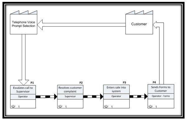
Figure 5: A basic start of a Value Stream Map for the Shoe Emporium sales process. The stream “supplier” is in the top left, the steps are bottom left to right, and we ultimately deliver to the customer again in the top right, completing the cycle.
As you go through the chapters in this book all of this will make more sense to you. Below are a few of the common icons you might come across in a Value Stream Map for you to reference as we progress.
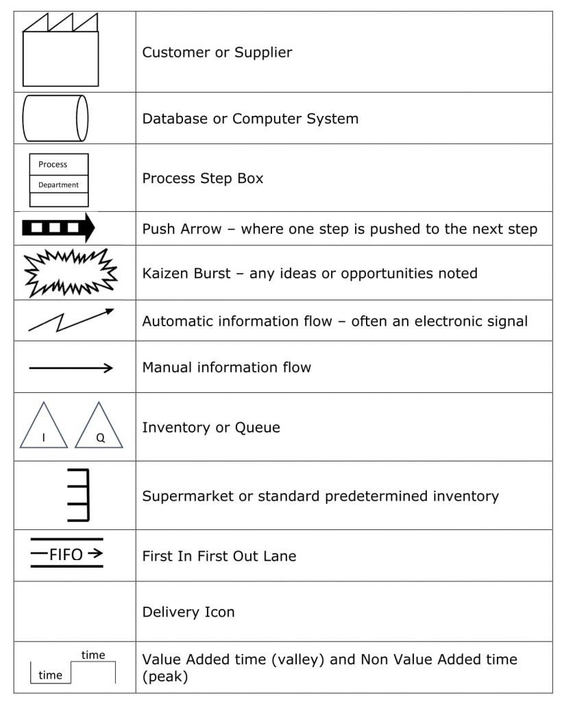
Figure 6: Some of the main Icons to help show your process clearly when creating a Value Stream Map.
A picture says a thousand words, so let’s add some of these icons in where they belong, and we can see how they work in our Value Stream Map.
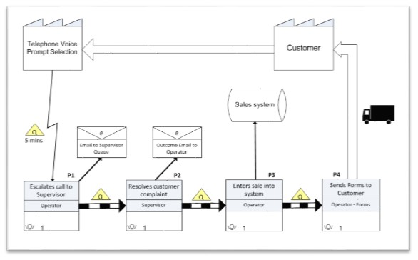
Figure 7: Our Value Stream Map with added systems, email communication, queues and delivery. With a little experience a map like this will be second nature to you.
We now can see queues in between our processes, an email communication, an automatic transfer of information from the telephone prompt, databases or systems for where our information is stored, and a truck icon at the end, showing the delivery of the forms to our customer to end this part of the process.
Swim Lane Flow Charts
For those of you who are not yet comfortable with a Value Stream Map, another way of mapping a process is to use a Swim Lane Flow Chart. Also known as a Business Process Map (BPM), it’s called a Swim Lane Chart because it looks like an Olympic swimming pool – but don’t be deceived by how simple it seems. This method of mapping a process is also extremely powerful.
Different departments or stations are noted on the left from top to bottom with their lanes extending to the right. It’s in these lanes that each step is noted, and the steps move up or down the lanes depending on who is performing the step. A picture will help:
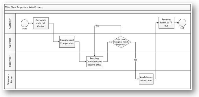
Figure 8: A basic example of a swim lane flow chart, used to map our value stream. The departments are vertical (up/down) and the process steps are horizontal (left to right).
The main difference is in the process boxes, where a square is a normal process, a diamond is a decision box (often posed as a “yes or no” question) with one or more pathways and a circle is the start or end of a value stream.
![]()
Figure 9: The three main types of process boxes in a Swim Lane Flow Chart. A decision process step is often posed as a “yes or no” question, with the answer influencing where the process goes from there.
You can often get a good idea of the process at a glance using this method. It is also very easy (once you have the hang of it) to quickly jot a Swim Lane Flow Chart down on a napkin or piece of paper over a cup of coffee with front-line team-mates. Next, we add some more information to our map so we can see any opportunities to improve at a glance.
 This is an excerpt from the book "Five Minute Lean", by David McLachlan - a wonderful book that blends teaching of the tools, culture and philosophy of traditional Lean with a modern-day Lean parable.
 You can get the whole book on Amazon here and enjoy your own copy.
Selected chapters from the story within Five minute Lean:
- Lean Parable – Where Lisa Makes a Change
- Lean Parable – Where Lisa Discovers a New Way
- Lean Parable – Where Lisa Performs a Balancing Act
- Lean Parable – Where Lisa Pulls the Trigger
- Lean Parable – Where Lisa Sets a New Standard
- Lean Parable – Where Lisa Becomes a Leader
Check out these selected chapters from the teachings within Five Minute Lean:
- Five Minute Lean – Get Your Map Started with a SIPOC
- Five Minute Lean – Map the Value Stream to Reveal Opportunities
- Five Minute Lean – The Power of Incentives – What is Measured and Rewarded Improves
- Five Minute Lean – Put it Together With Design for Ease of Use
- Five Minute Lean – Help Your Process Flow with Line Balancing
- Five Minute Lean – Create a New Standard Procedure and Checklist for Quality Control
- Five Minute Lean – Gather Direct Feedback and Indirect Feedback
- Five Minute Lean – Use Feedback to Fix and Guarantee
- Five Minute Lean – Create a Pull System with FIFO, Kanban Triggers and Visual Management
- Five Minute Lean Summary
- Five Minute Lean – Make Feedback Meaningful with Kano Analysis
- Five Minute Lean – Add Important Data to Your Map
- Five Minute Lean – Use Kaizen and Kaizen Events to Help Stakeholder Buy-In
- Five Minute Lean – Eliminate the Eight Wastes to Improve Flow
- Five Minute Lean – Build in Quality with Error-Proofing and Autonomation
- Five Minute Lean – Work Towards One-Piece-Flow (and Reducing Silos or Batching)
- Five Minute Lean – Organise Your Process with Five S
- Five Minute Lean – Implement With Agile for Fast Iterations and Feedback
- Five Minute Lean: Glossary
- Five Minute Lean – Go to the Gemba


